
Table of Contents
Last update: August 2026. All opinions are my own.
Web Development · Post 13/15
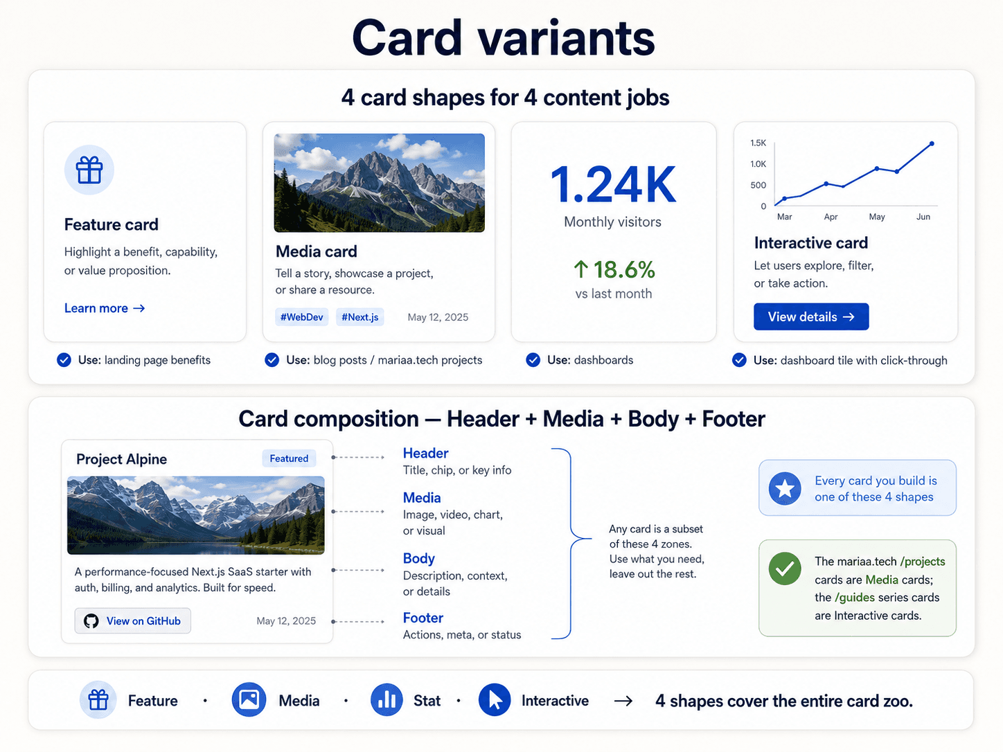
Look at any product homepage and you'll see cards everywhere — blog previews, product listings, feature grids, testimonials, dashboard widgets. Different content, same shape. The card is the workhorse of the interface.
The four regions of a card
Almost every card has some subset of:
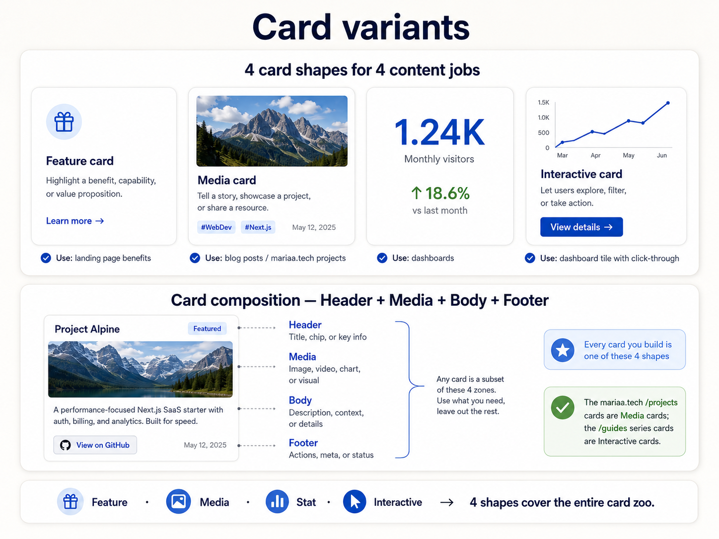
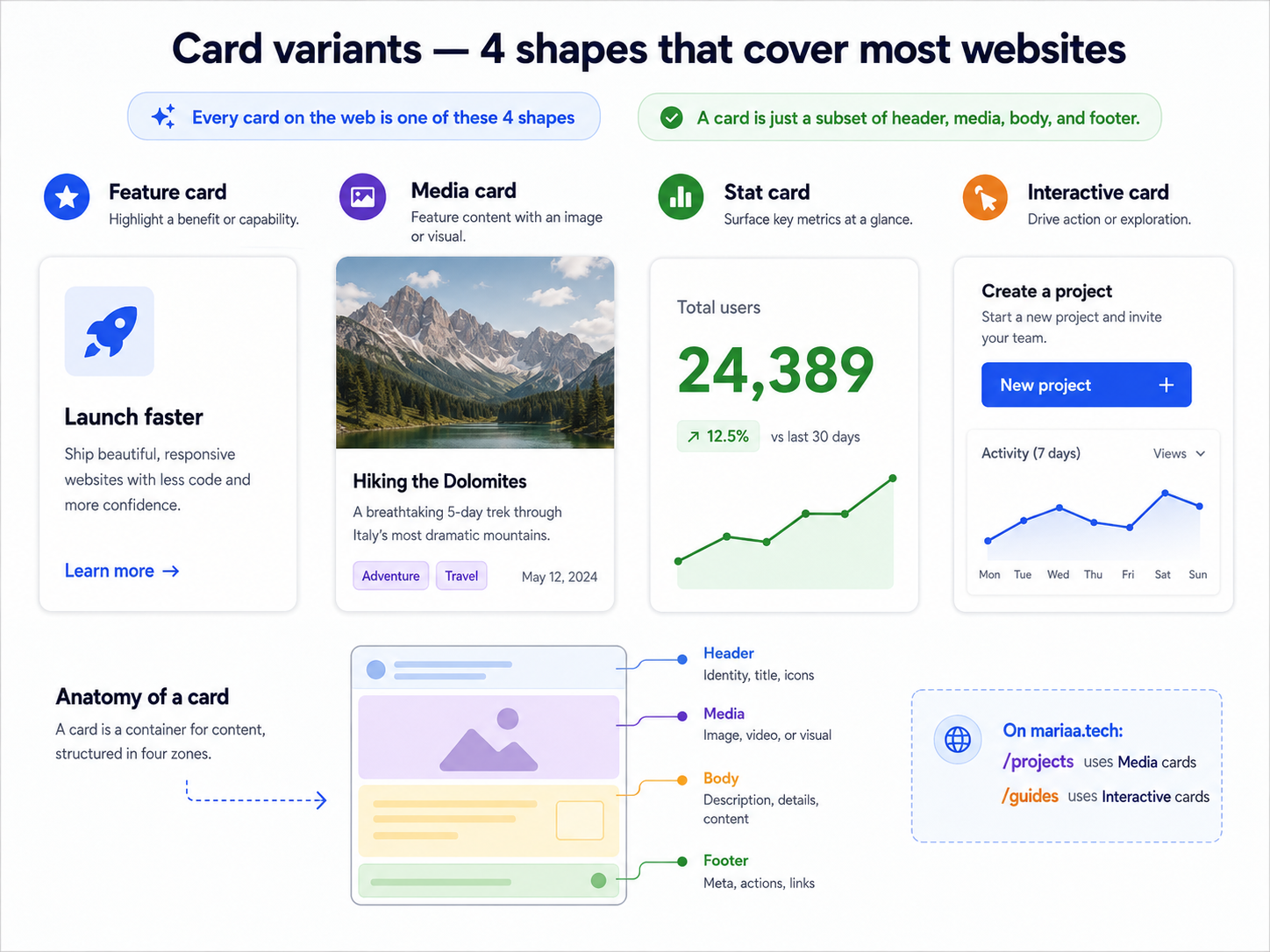
- Media (optional) — an image, illustration, or thumbnail at the top.
- Header — title, subtitle, maybe a badge or timestamp.
- Body — the main content. Text, metadata, a chart.
- Actions — buttons or links at the bottom. "Read more," "Add to cart," "Learn about this."
Not every card has all four. A blog card has media + header + body. A pricing card is header + body + actions. A statistic card is just header + body. The regions are a menu, not a checklist.
The one CSS pattern
A card is a div with:
.card {
  display: flex;
  flex-direction: column;
  gap: var(--space-3);
  padding: var(--space-4);
  background: var(--color-surface);
  border: 1px solid var(--color-border);
  border-radius: var(--radius-md);
  box-shadow: var(--shadow-sm);
}
Every token from the previous posts shows up here. Spacing scale, colour tokens, radius, shadow. This is the payoff — you're not making decisions per card, you're referencing decisions you already made.
Interactive cards
If the whole card is clickable, the outermost element should be an <a>, not a <div> with a onClick handler. Why:
- Right-click "open in new tab" works.
- Middle-click works.
- Focus and keyboard navigation work.
- Screen readers announce it as a link.
<a href="/post/slug" class="card card--linked">
  <img src="..." />
  <h3>Title</h3>
  <p>Excerpt</p>
</a>
The hover state is where you get to add polish — a subtle lift (transform: translateY(-2px)), a shadow bump (--shadow-md), a border colour change. Don't do all three at once, one is usually enough.
The "card in a card" trap
If you find yourself putting a card inside a card, stop. It almost always means the outer container should be a section (with a heading and no border), not a card. Cards are for one thing — one product, one post, one feature. Nesting them makes the visual hierarchy collapse.
Cards in a grid
The moment you have cards, you have a card grid. That's Post 3 — repeat(auto-fit, minmax(280px, 1fr)). Cards + grid + spacing scale = 90% of every list view in every product ever made.
Next up — Post 14: Component states.