
Table of Contents
Last update: August 2026. All opinions are my own.
Web Development · Post 3/15
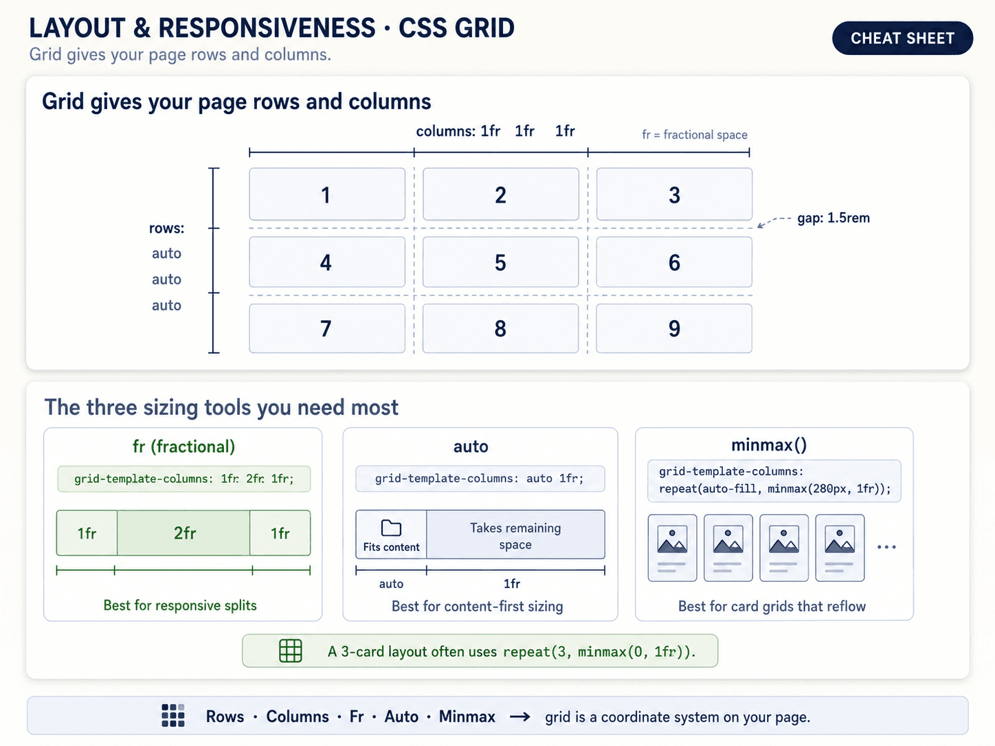
If Flexbox is "arrange things in one direction," Grid is "define a grid of cells, then drop things into them." Rows AND columns at the same time. This is what you want for anything that reads as a layout rather than a list.
The mental model: templates first, then items
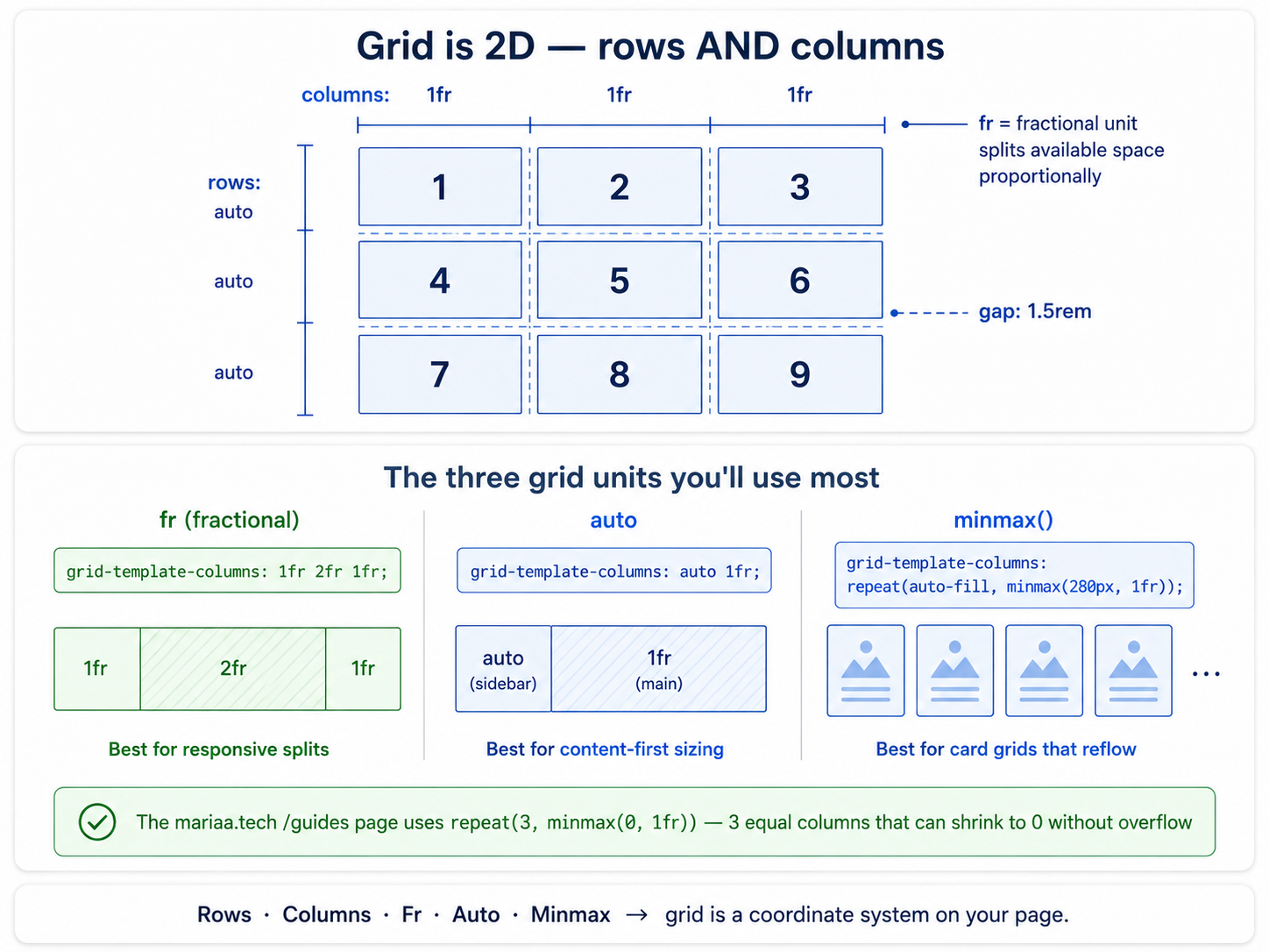
With Flexbox you set properties on the container and hope the children fall into place. With Grid you declare the grid up front — how many columns, how wide each is, how tall each row is — and then the children just slot in.
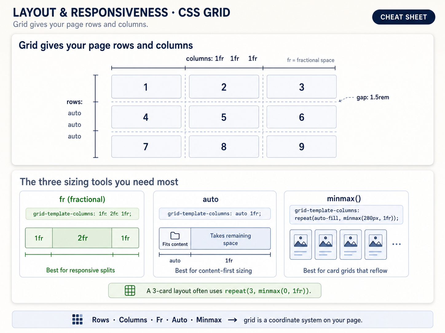
Same idea, drawn as a full infographic — grid tracks, cells, gaps, and how items span multiple cells:
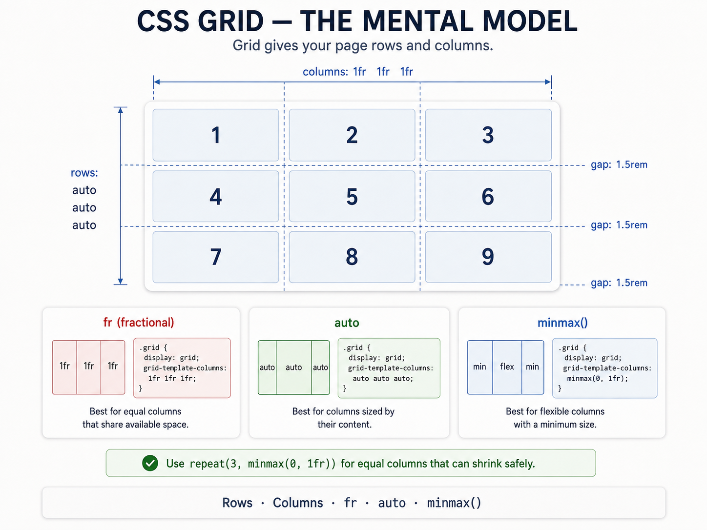
Two properties define the grid itself:
grid-template-columns→ the column tracks.grid-template-rows→ the row tracks.
And this is where the fr unit shows up, which is the thing that makes Grid feel magical.
fr — the "fraction of remaining space" unit
fr stands for fraction. It divides up whatever space is left after fixed sizes are accounted for.
.layout {
  display: grid;
  grid-template-columns: 200px 1fr 1fr;
}
The first column is a fixed 200px sidebar. The remaining space gets split evenly between the other two columns. Resize the window, and only those two columns stretch. That's what you want.
Compare to percentages: 200px 40% 40% breaks the moment the container isn't wide enough for 200px + 80%. fr never fights you.
minmax + auto-fit — responsive without media queries
This is the pattern I copy-paste the most:
.card-grid {
  display: grid;
  grid-template-columns: repeat(auto-fit, minmax(280px, 1fr));
  gap: 1rem;
}
Breaking it down:
minmax(280px, 1fr)→ each column is at least 280px wide, but grows to fill available space.repeat(auto-fit, ...)→ fit as many of those as the container allows. When there's room for 4, show 4. When the window shrinks and 3 no longer fit, drop to 2. Then 1.
No media queries. No breakpoints. The grid figures it out from a single line. This is why so many modern sites feel responsive without you being able to point at when the layout "flipped" — because it's not flipping, it's flowing.
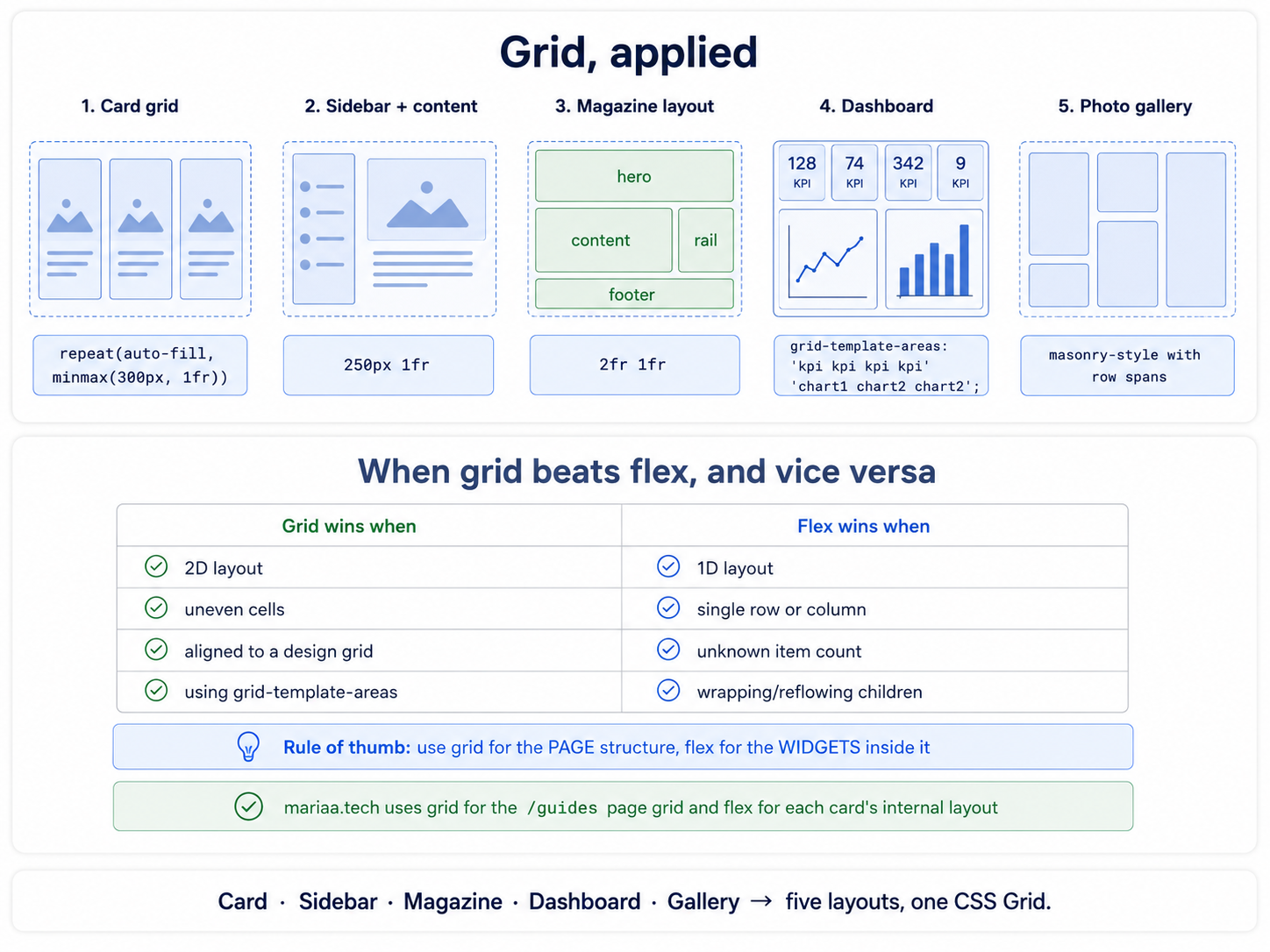
The six real Grid layouts
Just like Flexbox, you'll build the same handful of Grid layouts on repeat:
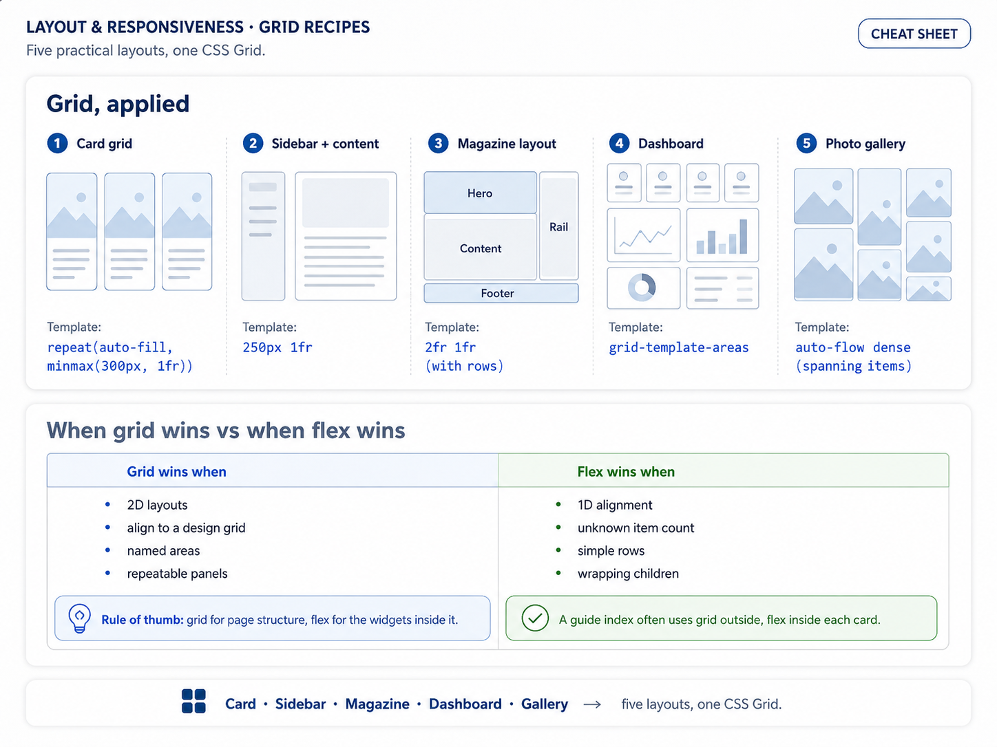
- Card grid — the
auto-fit + minmaxpattern above. - Sidebar + content —
grid-template-columns: 240px 1fr. - Magazine — a mix of column and row spans (
grid-column: span 2,grid-row: span 2). - Dashboard — same as magazine, but with more cells and typically named grid areas.
- Photo gallery —
auto-fitwithminmax(200px, 1fr)andaspect-ratio: 1. - 12-column layout — the Bootstrap-style
repeat(12, 1fr)that lets you place things on any column line.
Full grid reference
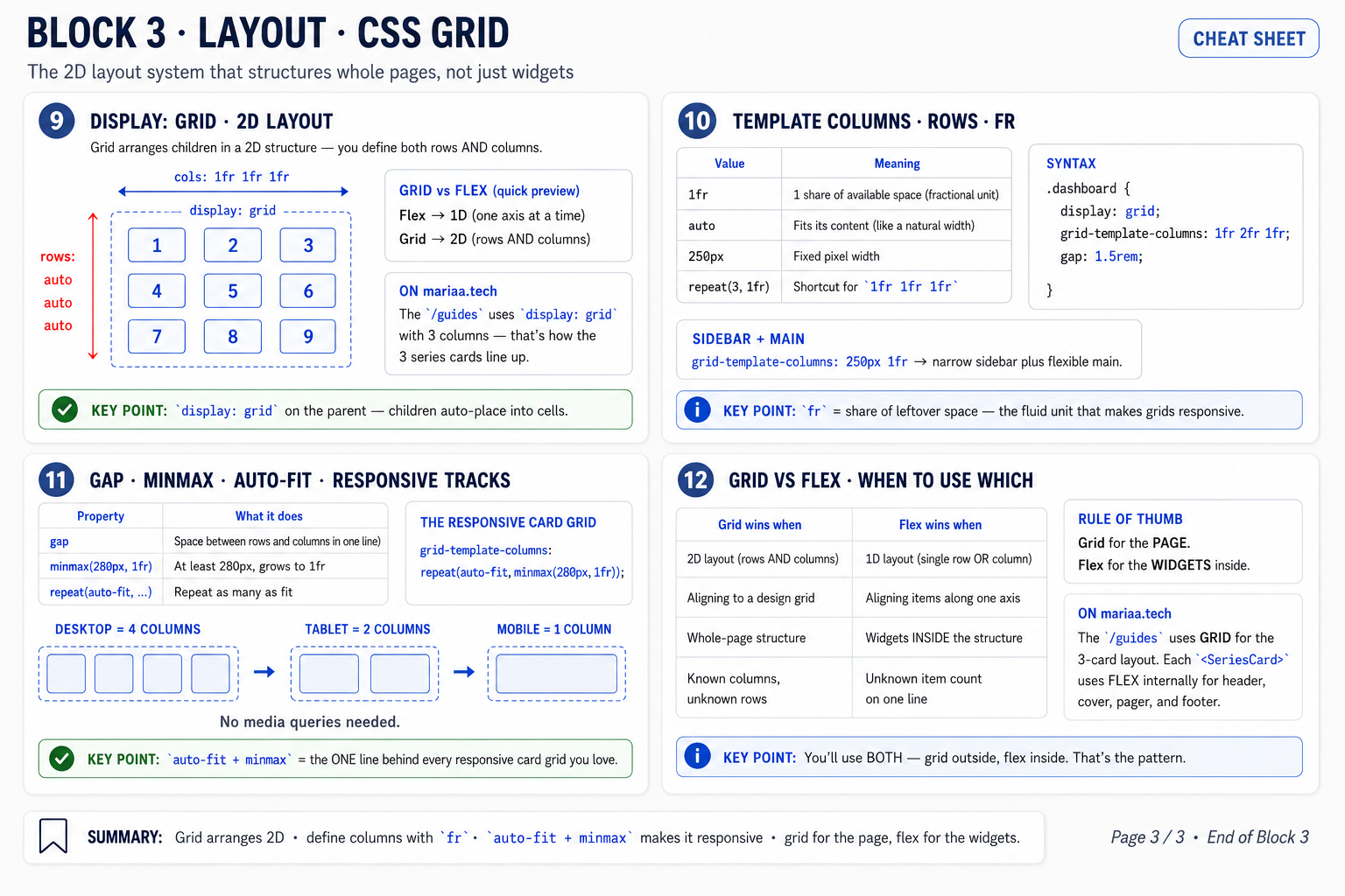
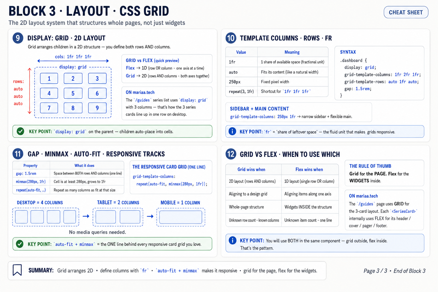
Every property, every value, every keyword you'll actually use — bookmark all three:
When Grid beats Flexbox (and when it doesn't)
If you're aligning items in one direction and letting them wrap, Flexbox is simpler. If you're placing items in two directions — where things need to line up across rows AND columns — Grid wins every time.
The give-away that you're reaching for the wrong tool: nesting. Nesting three flex containers to fake a grid is a smell. Nesting a grid inside a grid inside a grid to align things in one direction is also a smell. Match the tool to the axis count.
Next up — Post 4: Responsive design — breakpoints and mobile-first.