
Table of Contents
Last update: August 2026. All opinions are my own.
Web Development · Post 2/15
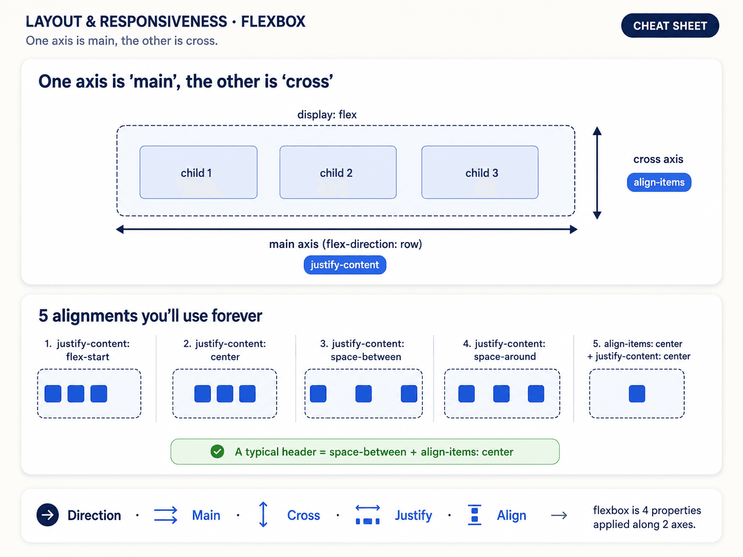
Flexbox is the layout tool you reach for when you want to arrange things in one direction — a horizontal navbar, a vertical stack of cards, a form with a label on the left and an input on the right. If you're thinking rows AND columns at the same time, that's Grid (Post 3). Flexbox is one axis at a time.
The mental model: main axis vs cross axis
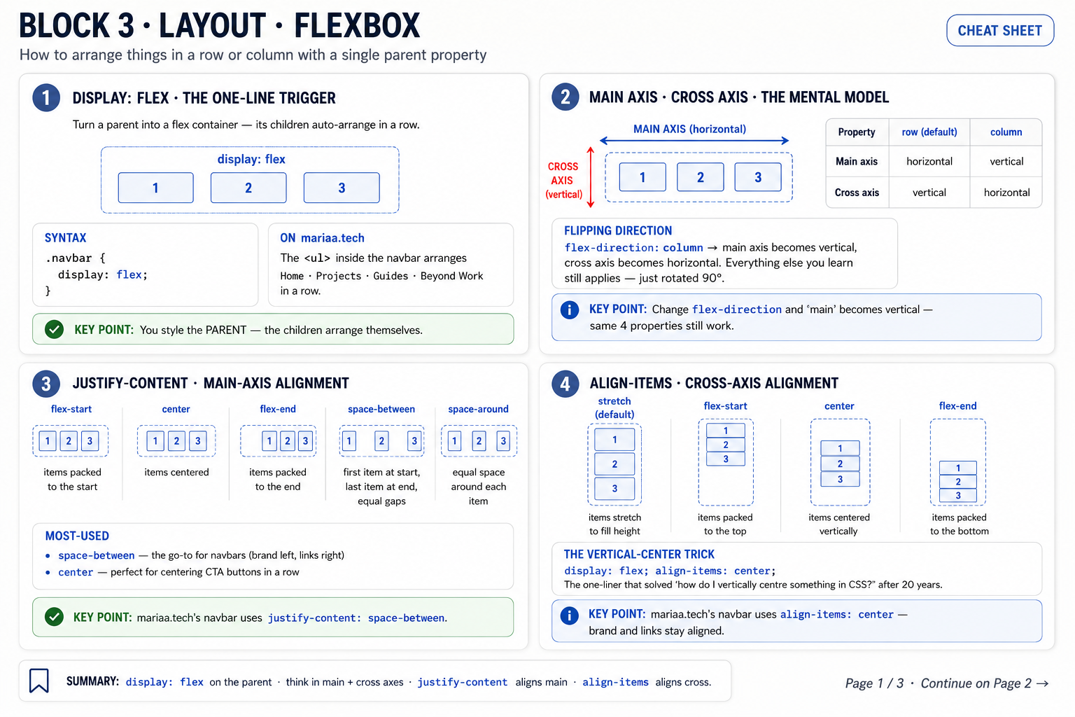
The single idea to internalise: a flex container has a main axis and a cross axis. Everything you do with Flexbox is aligning children along one of those two axes.
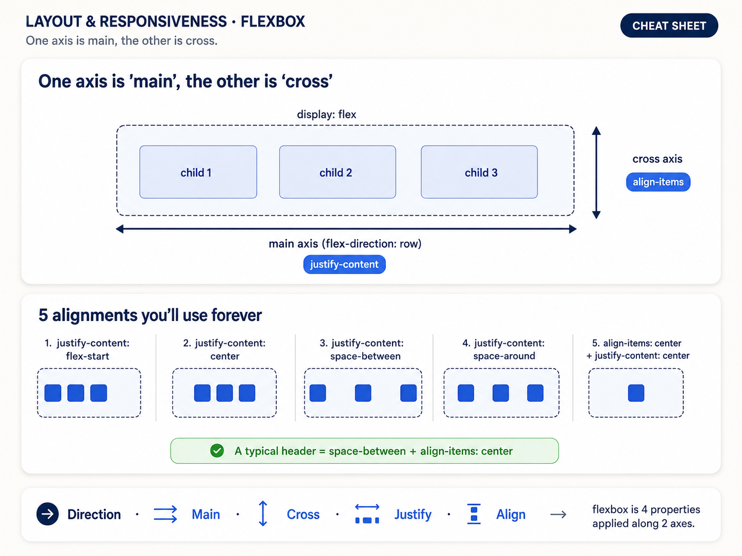
Same idea, drawn as an infographic so both axes are labelled with the properties that control them:
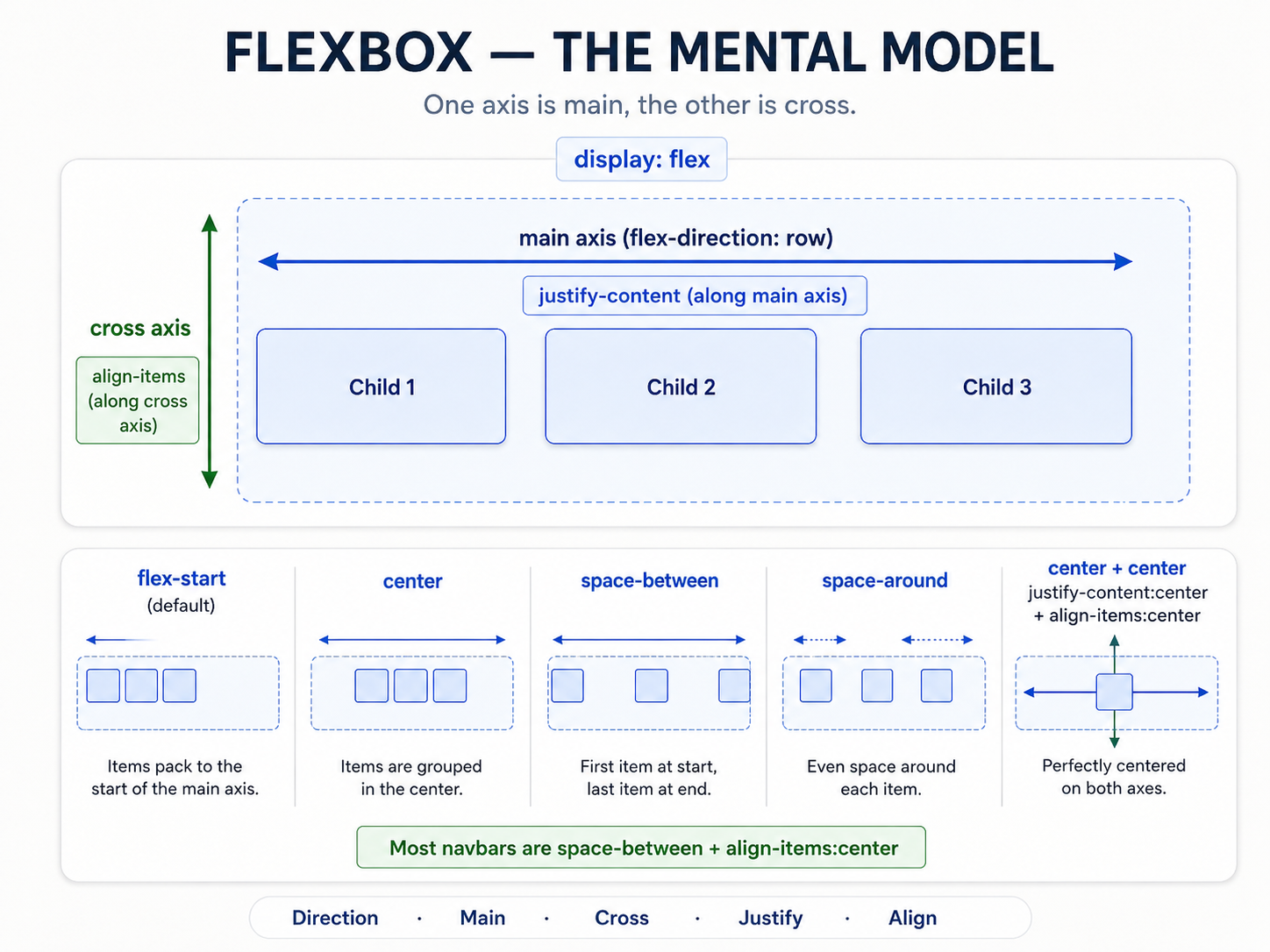
flex-direction: row(the default) → main axis is horizontal, cross axis is vertical.flex-direction: column→ main axis is vertical, cross axis is horizontal. Everything you knew swaps.
Then two properties do 90% of the alignment work:
justify-content→ spaces items along the main axis.align-items→ spaces items along the cross axis.
That's it. If you forget which is which, remember: justify = main, align = cross. Change flex-direction and the meaning of those two properties rotates with it.
Alignment visualised
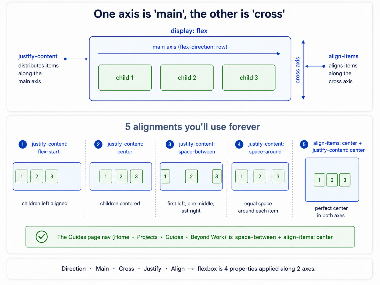
The words flex-start, center, space-between, space-around, space-evenly are only useful if you can see what they do. This one image is worth memorising:
The gotcha nobody warns you about
justify-content doesn't work on the main axis you think it does — it works on the main axis of the current flex-direction. So the same rule (justify-content: center) centres things horizontally when direction is row, and vertically when direction is column. It's not a horizontal/vertical thing. It's a main-axis thing.
Once you internalise that, you stop guessing.
The six recipes
You will build the same six layouts over and over. Learn them once and you're done:
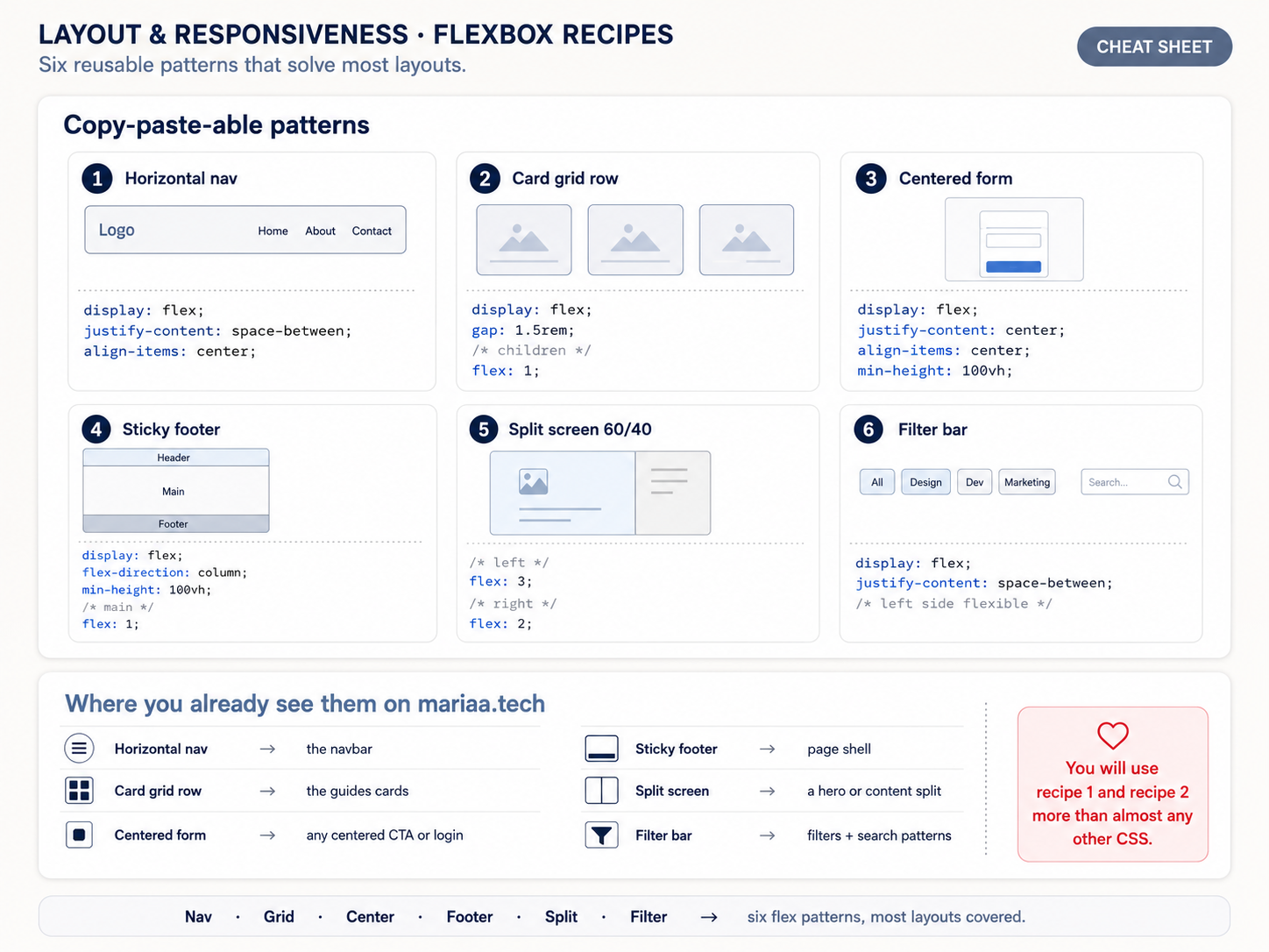
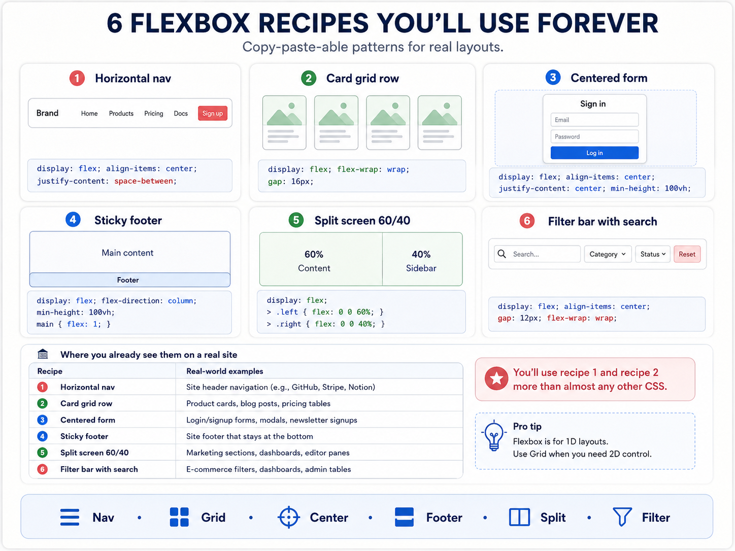
- Nav bar — logo on the left, links on the right.
display: flex; justify-content: space-between. - Card grid that wraps —
display: flex; flex-wrap: wrap; gap: 1rem. - Centred form — literally centre anything on the page.
display: flex; align-items: center; justify-content: center; min-height: 100vh. - Sticky footer — footer glued to the bottom even on short pages.
display: flex; flex-direction: column; min-height: 100vhon the body,flex: 1on main. - Split screen — 30/70 or 50/50 side-by-side.
display: flexon the parent,flex: 3andflex: 7on the children. - Filter bar — a horizontal row of pills that scrolls when overflowing.
display: flex; gap: 0.5rem; overflow-x: auto.
You could build a whole portfolio on those six patterns alone. Most people do.
Full flexbox reference
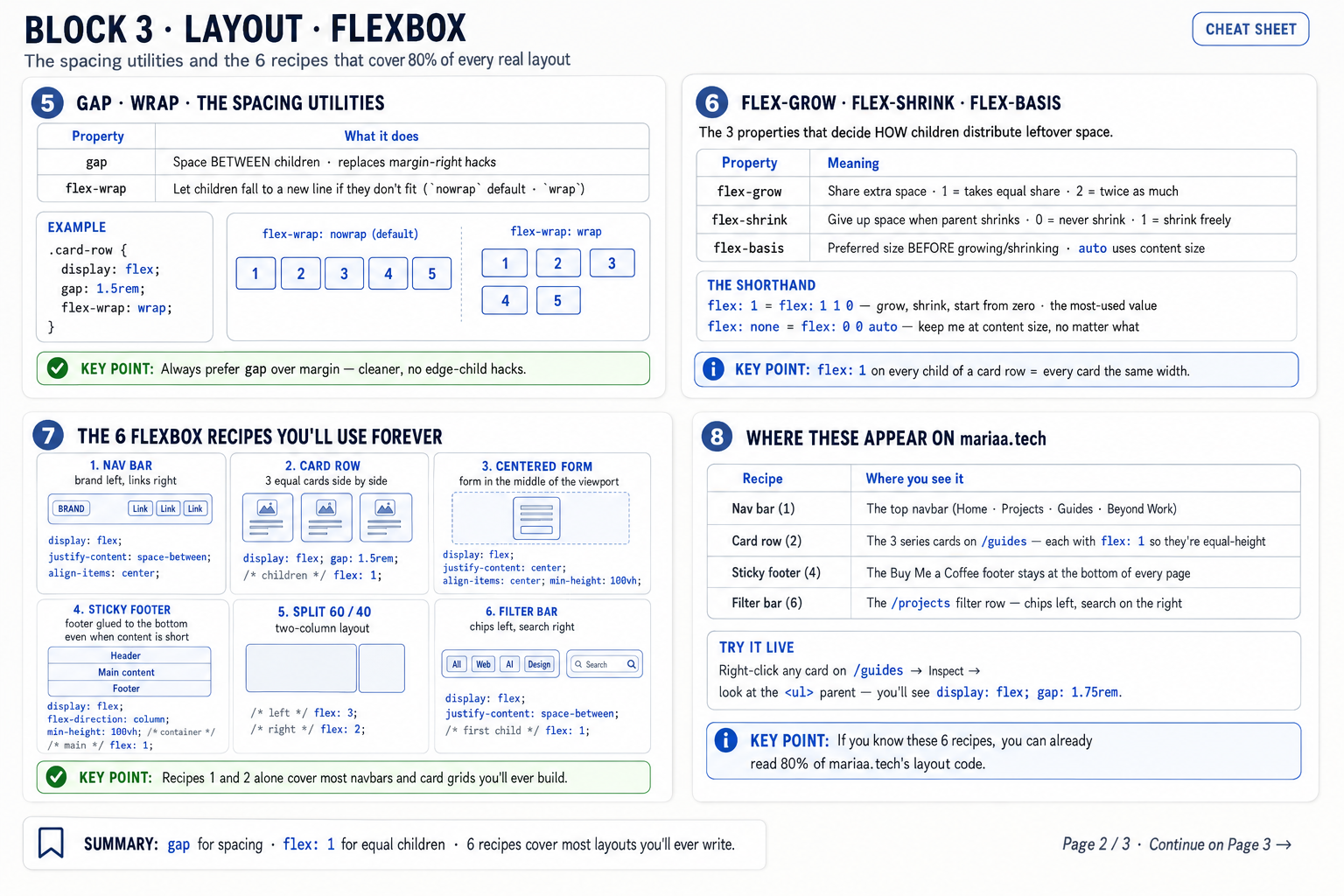
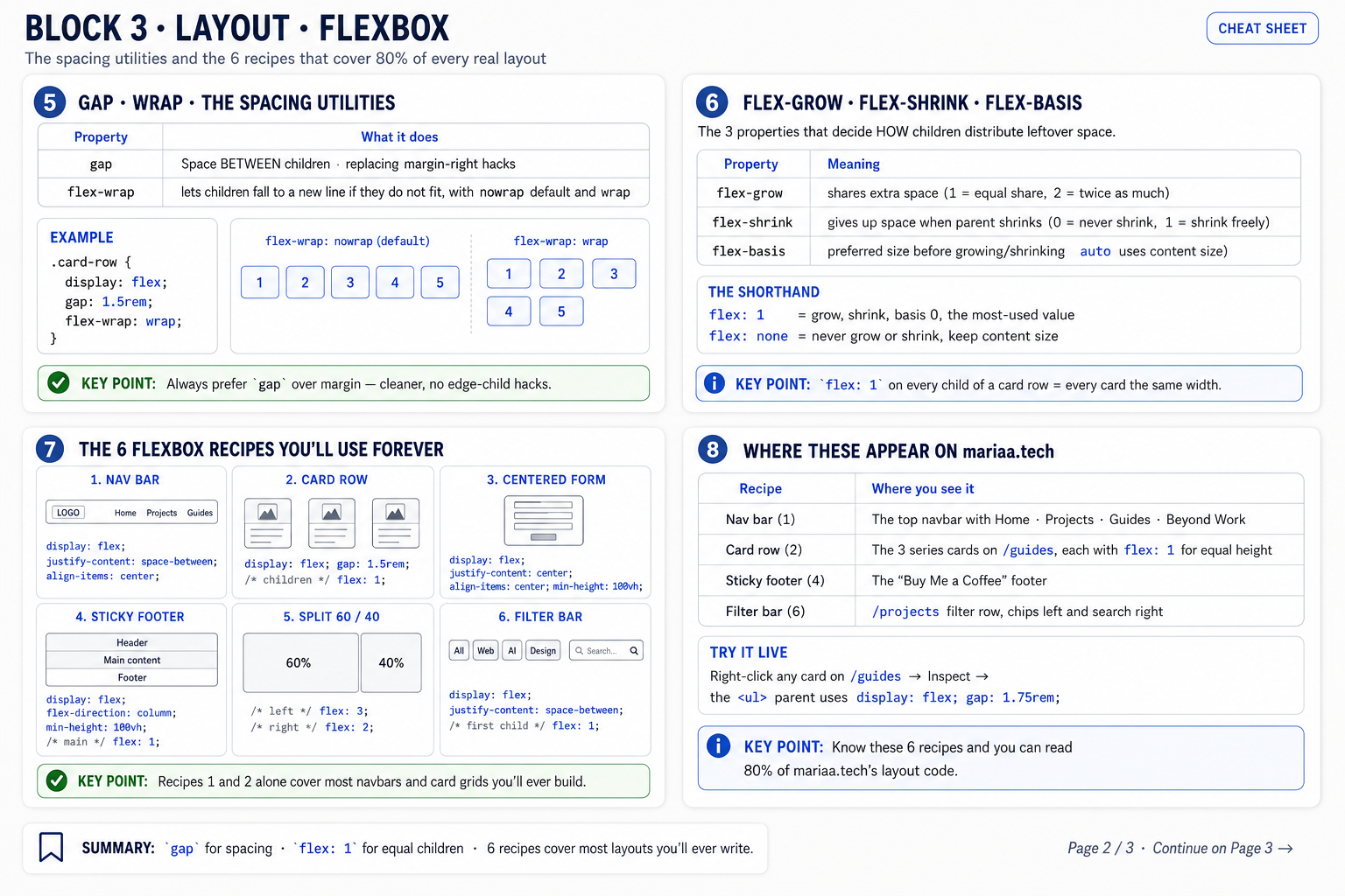
If you want the whole cheat sheet — every property on the container, every property on the items, every keyword you can pass — these are the ones to bookmark:
When Flexbox is the wrong tool
Flexbox falls apart the moment you need rows AND columns at the same time — a magazine layout, a dashboard, a photo gallery where images align across both directions. That's what Grid is for. If you find yourself nesting flex containers three levels deep to fake a 2D layout, stop — you want Grid.
Rule of thumb: one axis → Flexbox. Two axes → Grid.
Next up — Post 3: CSS Grid — 2D layouts.