
Table of Contents
Last update: August 2026. All opinions are my own.
Web Development · Post 12/15
Forms are the place users decide whether they trust your product. A bad form makes people abandon the flow — not because they can't figure it out, but because it feels like the app doesn't know what it's doing.
The good news: the same four-part anatomy works for every field, and the same five states cover every situation.
The anatomy of a single field
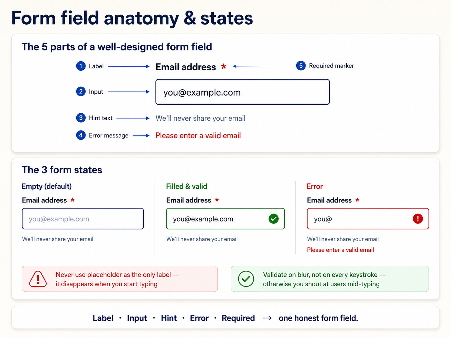
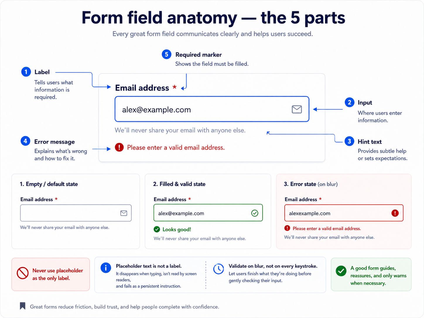
- Label — always visible, always above the input (not to the left, not floating inside). Explains what the field is for.
- Input — the actual control. Text, number, select, checkbox, whatever.
- Helper text — small, subtle. Extra context ("we'll never share this," "format: 10 digits").
- Error text — replaces the helper when validation fails. Explains what's wrong and how to fix it.
The placeholder text (inside the input) is not a label. It disappears the moment the user starts typing, which means they can't remember what the field was asking. Use it only for format hints ("e.g. jane@doe.com") if at all.
The five states of any field
- Default — empty and untouched.
- Focused — cursor is in it. Border darkens, focus ring appears.
- Filled — user has entered something. May or may not be valid yet.
- Error — validation failed. Border goes red, error text appears below.
- Disabled — can't be edited. Grey out the whole thing.
Some systems add a success state (green border, checkmark) for fields where confirmation matters — email verification, password strength, unique username checks.
Validation: when to check
Three timings, in increasing intensity:
- On submit — the whole form validates when the user hits submit. Simple, safe, but late — the user has already tried to send it.
- On blur — validate a field the moment the user tabs out of it. This is the sweet spot for most forms.
- On input — validate on every keystroke. Only for real-time-relevant fields (password strength meters, "username taken" checks). Otherwise it feels naggy.
The general rule: be forgiving during entry, strict after leaving the field. Nobody wants "invalid email" to flash after they've typed the first letter.
Error messages: help, don't scold
- ❌ "Invalid input."
- ❌ "This field is required."
- ✅ "Enter your email address, e.g. jane@example.com"
- ✅ "Password needs at least 8 characters, including a number."
Say what's wrong AND how to fix it. If the error text doesn't tell the user what to do next, it's failing its only job.
Feedback beyond errors
Errors are one kind of feedback. Success confirmations, loading states, and progress indicators all count too — they're what tell the user the app is listening:
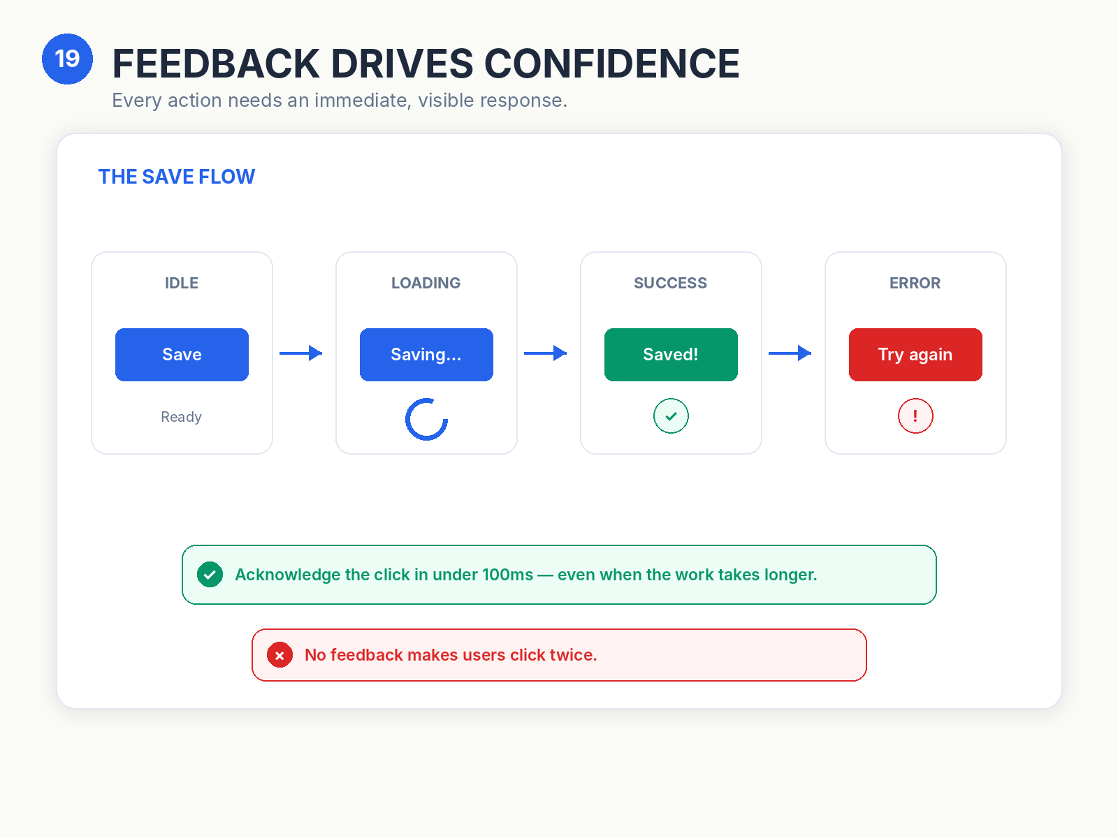
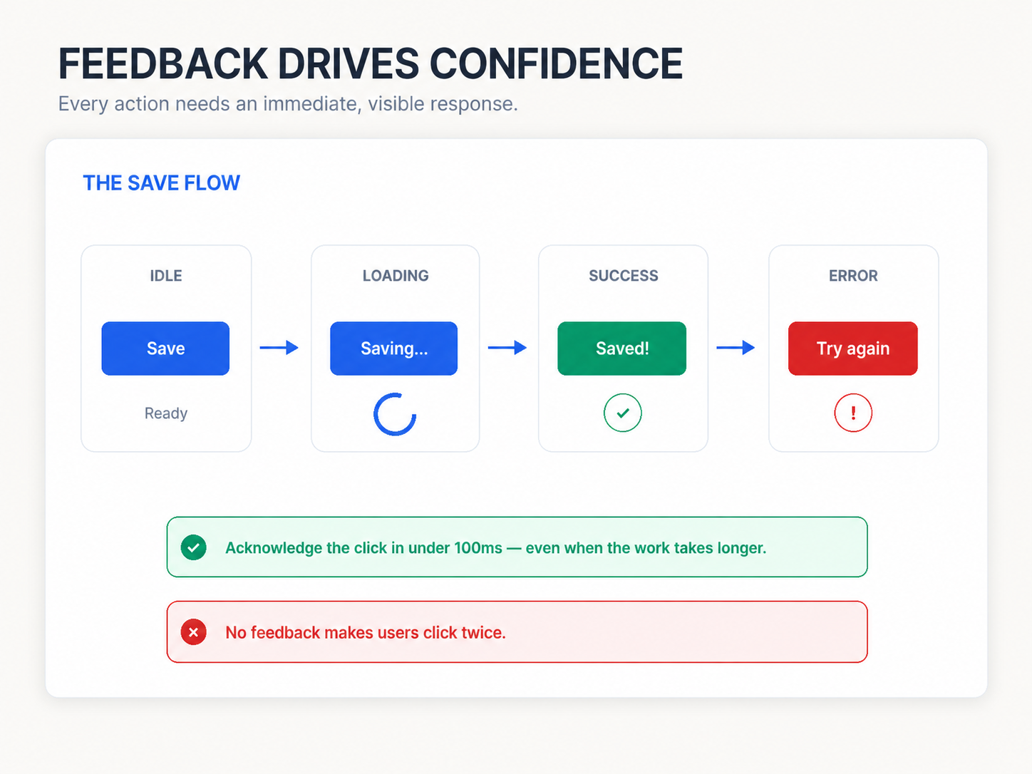
If a form submits and nothing visibly changes, users will click submit again. And again. Show a spinner. Change the button label. Do something.
Next up — Post 13: Cards.